On Painting The Sun: Monet’s Choice
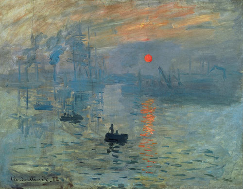
If you paint the sun, you are always confronted with a specific choice: you either have to try and establish the correct value relationship by making the sun very light on your canvas or you must go for the color, in which case the value relationship will be incorrect but the color relationship will be closer to the truth. The reason for this is simply that the highest value pigment we have is pure white. (It is unlikely we would even use pure white because a glob of pure would look “chalky” or artificial.) Once we add color, say a tiny bit of cadmium yellow light, it would look somewhat more real, but then the brightness or value would be diminished by that tiny amount. And if we were to then mix in small amounts of cadmium orange or maybe vermillion, we would probably get closer to the actual color of the sun, particularly if it were low in the sky, but at the same time the value or brightness would decrease even further. Such is the nature of paint as compared to actual light, or energy. So the choice is either to go for the value, white with a tiny bit of yellow (which would be the highest value color note we could make), or to go for the color – a hot orangey-red color, perhaps. It’s one or the other. But both are impossible. Let me use Monet’s famous Impression Sunrise to illustrate this point:


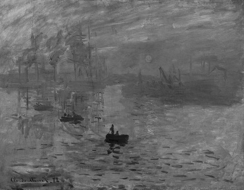
On the left is the actual famous painting and on the right is the same painting but in black and white. Notice how the sun in the black and white version practically disappears. What this means is that in the actual painting (in color), the sun is the same value as the darker blue colors. In other words, Monet has sacrificed value in order to get the color. Let’s see what it would have looked like had he done the reverse, if he had sacrificed color in order to get closer to the proper value relationship.


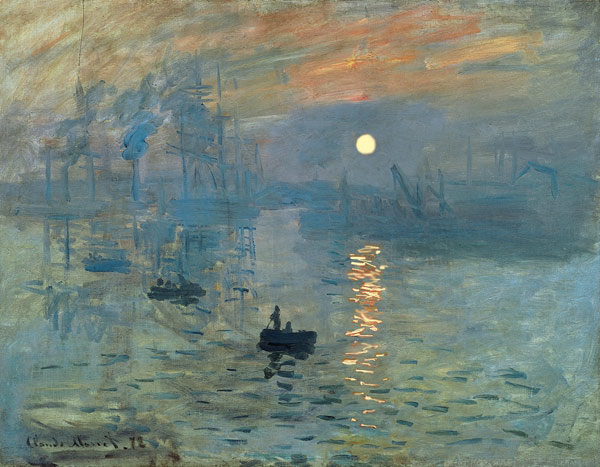
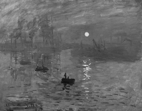
In the image on the left I have replaced Monet’s orangey-red sun and its reflection with white and a tiny bit of yellow. Notice that in the black and white version on the right, the sun is the brightest thing in the sky; the value relationship is relatively correct. But in order to get closer to the correct value, the richness of the color is lost.
Here’s the point: there is no way to get rich color and high value with paint. It comes down to choice. Some artists (George Inness comes to mind) have made wonderful paintings where the sun is bright but weak in color. Monet, however, always seems to have gone for the color.
My Big Fat Warning!
I am hopeful that this type of blog provides some food for thought. But I hesitate in writing this sort of thing because the information also feeds a mechanical process that becomes a formula. It is fine, if not necessary, to have knowledge in the back of your head, but when you are painting, the process must be driven by the feelings you have as you become one with nature, when you resonate or vibrate with the light that is absorbing you, and you it. So it would be unwise to go out and say, “I’m going to approach it the way Monet did as opposed to the way Inness did.” Rather, wait until you get there. Open yourself to seduction. Will you get lost in the warm volcanic vermillion of the sun’s warmth or will you surrender to the bright dancing notes of a sparkling sun? Formula picture making is so 9 to 5.
16 Comments
Address
Via Teresio Olivelli, 20
22021 Bellagio (CO)
Italy
+39 338 975 7135
Open Hours
Tuesday - Saturday: 11:00am – 6:00pm
Sunday - Monday: 1:00pm – 6:00pm

I love your teaching, as usual friend. I’ve learned from this.
Thanks Jay; always nice to know someone is reading these things!
Thanks for sharing this advanced tips ! Now I understand some difficulties that I have when trying to paint pear (on light) with real values – but always miss some more colors…
Very good food for the painter’s thought. So much better to learn to think than to learn the ‘rules’. Thank you.
Yes, better to reflect upon rules and see if they are appropriate. Unthinking adoption of anything is probably always bad. However, it is also important to cherish one’s feelings and not prioritize thinking or the mind. It’s always mind and body; after all, it is called visual art.
Reading your blogs makes me see the light.
Again, thank you – each newsletter brings a little more understanding and a new way of looking, seeing and feeling.
I am going to use the photo technique on my own work to see if I have any values at all!!
Thank you!!
Thanks Sandy; you mean to say…”if my values are related at all” ….it’s all about
relationships.
I thought this was very helpful. I need to understand, recognize and ‘apply’ the value relationships… if that is the choice I make
Yes Molly, that is correct. But it is impossible to really get the correct value relationships when you are looking into a source of light, given that the actual direct light is so much brighter than our lightest color. It’s tough either way, especially when the sun is low because it seems to be moving very fast. Look up Inness; he does a good job of it. And don’t let the “understanding” part get in the way of feelings; it’s all feeling driven in the end.
Thank you for a great lesson, Jerry. Do give more of them, as the technical allows for freedom of feeling. (Like a concert pianist.) If I don’t know this about colour, I’ll be floundering among the hi-key values and waste time and the feeling would be — frustration!
So thank you!
Hi Charlie, thanks. However, I don’t believe that it is technique that permits various feelings. I think it is the reverse. Techniques are invented to sustain the feeling of becoming larger. This is why learning “techniques” in the abstract does not make a better artist. One must understand that the process is what allows one to become more; it is really learning about new ways to be free otherwise techniques just become tools to produce more efficiently.If Monet didn’t get a rush from the orange-red, he would have kept it a very high value: correct but he wouldn’t have become more Monet.
“What this means is that in the actual painting (in color), the sun is the same value as the darker blue colors.” And yet the orange circle seems so much brighter. Why is that?
Value and color are two different things. Two colors can have the same value (various reds, oranges, blues, etc)
but the colors are so different that they separate from one another. If you took a black and white photo of
a rainbow, you wouldn’t see much. Remember, all colors are relationships. You wouldn’t say something is orange; it has to be orange in relationship to something. Thus an orange next to a blue will look different than an orange
next to a red. Monet is using orange next to a lot of dull colors so the relationships is such that it appears
very bright.
A very good presentation and insight of light and value.
I have always believed that value is more important than actual color, (intensity and temperature} because it helps us to read a composition better. Your insight and understanding has helped me a lot. I suppose I lean more towards Innes, but I can still understand Monet more now!
Thanks for sharing these wonderful thoughts.
You’re quite welcome Jef. I struggle all the time with color in “white” clouds or reflections;
paint just can’t get very light and very colorful at the same time. So Monet’s solution worked
for him and I have tried it too but it doesn’t seem to want to work for me. A mystery.